Why Print Colour Looks Different From Your Screen
Impress Printing · 2 July 2024
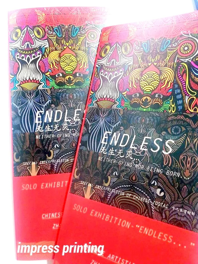
Many customers find printed colours duller than on screen, especially bright greens, blues and pinks. It comes from how screens and ink make colour.
RGB is light, CMYK is ink
Screens mix red, green and blue light (RGB), which can be very bright. Printing uses four inks, cyan, magenta, yellow and black (CMYK), with a narrower range, so some screen colours cannot be printed exactly.
Paper changes colour too
- Art paper is coated, the ink sits on top, and colour is vivid and sharp.
- Woodfree and book-cream paper are uncoated; ink soaks in and colour is a little softer.
- Kraft and coloured papers mix their own colour with the ink. They suit black or dark ink; light colours sink in.
How to reduce the difference
- Convert files to CMYK before sending to see colour closer to print.
- Send brand colours as CMYK or Pantone values, or a previous print with the right colour.
- If colour matters, order a sample copy first.
See each paper on the paper guide.
Have something to print? Send the details on LINE. We reply during opening hours, Monday–Friday 8:30–17:30.
Add LINE @impress-print